Website templates come with a range of features that provide all the elements needed to create a web page or an entire website. Features to look our for in a template include the following.
Layout
Web page layout with text and image blocks, columns and rows. These should provide the basic framework for the homepage and content pages, along with any specific purpose pages such as galleries, search result pages, category and item browsing pages, and contact pages with contact forms.
The template should provide all the required formatting styles for page text fonts, headings, links and menus, including font type, size, colour, padding and margins. Ideally there should be built in tools and settings that will allow the various styles and layout elements to be adjusted across all pages, and also on specific pages. The ability to adjust settings is usually found in a CMS template for content management systems such as Joomla and Wordpress.
Responsive
Responsive to different screen sizes, with visibility of some elements determined by display size and type. This is an important feature for modern templates that have to meet various web usability standards and page speed test, often set by Google to ensure quality content with optimal user experience. The responsive features will allow the page content to adjust in layout depending on the screen size, and to even remove certain elements, such as banner slide shows, on smaller screens such as mobile devices.
Mobile Optimized
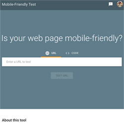 Mobile optimized is a separate feature to provide easy to read and navigate content to the smaller screens on mobile devices. Mobile devices also lack a mouse and rely on touching of screen elements such as menu links. A mobile optimized template will ensure that the clickable elements are not too close together so that they can be easily selected on a mobile phone. A mobile optimised website template will change the layout so that the content is easily readable without pinching and zooming. It is useful to check just how mobile friendly a template is by going to the Google Mobile-Friendly Test if you have a live version of the template that can be input to run the test on.
Page Speed
Ideally the website template should be Page Speed optimized to ensure quick download times often using compressed scripts and css. This can be an important feature for Search Engine Opimization (SEO). You can check the page speed at the Google Page Speed Insights.
Media Management
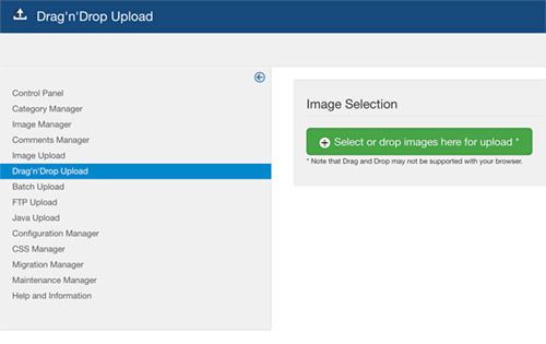
Ideally the CMS should include a robust and easy to use media management features. This should cover the uploading, storing, resizing and use of images in JPG, or other web, format. It is important that the CMS template system can incorporate images that have been properly resized to use the exact dimensions as displayed in the web page, and not to load 'original' images that may have been uploaded. These will often be many MB's in size, and will cause the website to load very slowly. Below is the drag and drop interface used in Joomla.